Prediction plots for logistic models: improvements #120
Comments
if (outcome_is_factor) {
predicted <- predicted + 1
} |
|
The main issue is fixed using your suggestion Mattan, even though I'm not sure whether it's the best solution to modify the predictions rather than, somehow, the levels. Because, for instance, it also messes up the position of the dotdensity. On top of that, I'm not sure how to pick the best default values for the dotdensity so that the plots are fairly consistent (the dots have the same size or the same "height" ) in respect to the amount of data. library(ggplot2)
p <- plot(modelbased::estimate_relation(glm(vs ~ mpg, data = mtcars, family = "binomial")))
p +
geom_dotplot(
aes_string(x = "mpg", y = "vs"),
data = mtcars[mtcars[["vs"]] == 0, ],
method = "dotdensity",
binwidth = 1/30 * diff(range(mtcars[["mpg"]])),
stackdir = "up",
show.legend = FALSE)p <- plot(modelbased::estimate_relation(glm(sex ~ body_mass_g, data = palmerpenguins::penguins, family = "binomial")))
p +
geom_dotplot(
aes_string(x = "body_mass_g", y = "sex"),
data = palmerpenguins::penguins[palmerpenguins::penguins[["sex"]] == "female", ],
method = "dotdensity",
binwidth = 1/30 * diff(range(palmerpenguins::penguins[["body_mass_g"]], na.rm = TRUE)),
stackdir = "up",
show.legend = FALSE)
#> Warning: Removed 11 rows containing non-finite values (stat_bindot).Created on 2021-06-10 by the reprex package (v1.0.0) |


|
These are the two options I can think of... library(ggplot2)
fct <- mtcars$am |> factor()
x <- mtcars$mpg
pred <- runif(length(x))
ggplot(mapping = aes(x, fct)) +
geom_point() +
geom_point(aes(y = pred + 1), color = "red")ggplot(mapping = aes(x, as.numeric(fct) - 1)) +
scale_y_continuous(breaks = c(0, 1), labels = levels(fct)) +
geom_point() +
geom_point(aes(y = pred), color = "red")Created on 2021-06-10 by the reprex package (v2.0.0) |


|
What do you think of the viewport overlay I linked to? |
What do you mean? |
|
That code produces |
|
Yes this is my goal, it is the same as above in my example; i.e., it uses |
|
@mjskay you are the leading expert on dotplot scaling. Any ideas? |
|
sure, here's a quick example with ggdist::geom_dots, which is designed for exactly this kind of problem :) # took me a minute to get this working since your master branch appears broken?
p <- plot(modelbased::estimate_relation(glm(sex ~ body_mass_g, data = palmerpenguins::penguins, family = "binomial")))
p +
ggdist::geom_dots(
aes_string(x = "body_mass_g", y = "sex"),
data = na.omit(palmerpenguins::penguins[palmerpenguins::penguins[["sex"]] == "female", ]),
color = "black",
fill = "gray50",
alpha = 0.5,
scale = 0.45,
side = "top"
) +
ggdist::geom_dots(
aes_string(x = "body_mass_g", y = "sex"),
data = na.omit(palmerpenguins::penguins[palmerpenguins::penguins[["sex"]] == "male", ]),
color = "black",
fill = "gray50",
alpha = 0.5,
scale = 0.45,
side = "bottom"
) +
theme_light()
The use of Incidentally writing this example this caused me to find a bug (mjskay/ggdist#74) in the |

|
Awesome, thanks a lot for your input! |
|
Happy to help! :) Incidentally I fixed the |
|
Also, if you find any weird corner cases where the automatic bin width detection doesn't work well, please let me know --- it's a hairy problem and improvements have really been driven by real-world examples of when it doesn't work. I'm happy to make further improvements! |
|
It seems I am late to the party... but in my field (pharmacometrics) the standard diagnostic plot for logistic regressions is an overlay with binned observations (often "quartiles" -- actually fourths, but they're called quartiles....) I'm not sure how something like this would work with the dotplots
they're not strictly goodness of fit plots, but they give some sense of how the model predicts the data, especially if all relevant predictors can be visualized. Internally, this uses both ggeffects and emmeans, I am not sure if all functionality can be also created with modelbased, but if it could and this type of plot can be natively supported, that would be cool. |


|
I think the initial issue is fixed, we "just" need to add the ggdist-stuff. |
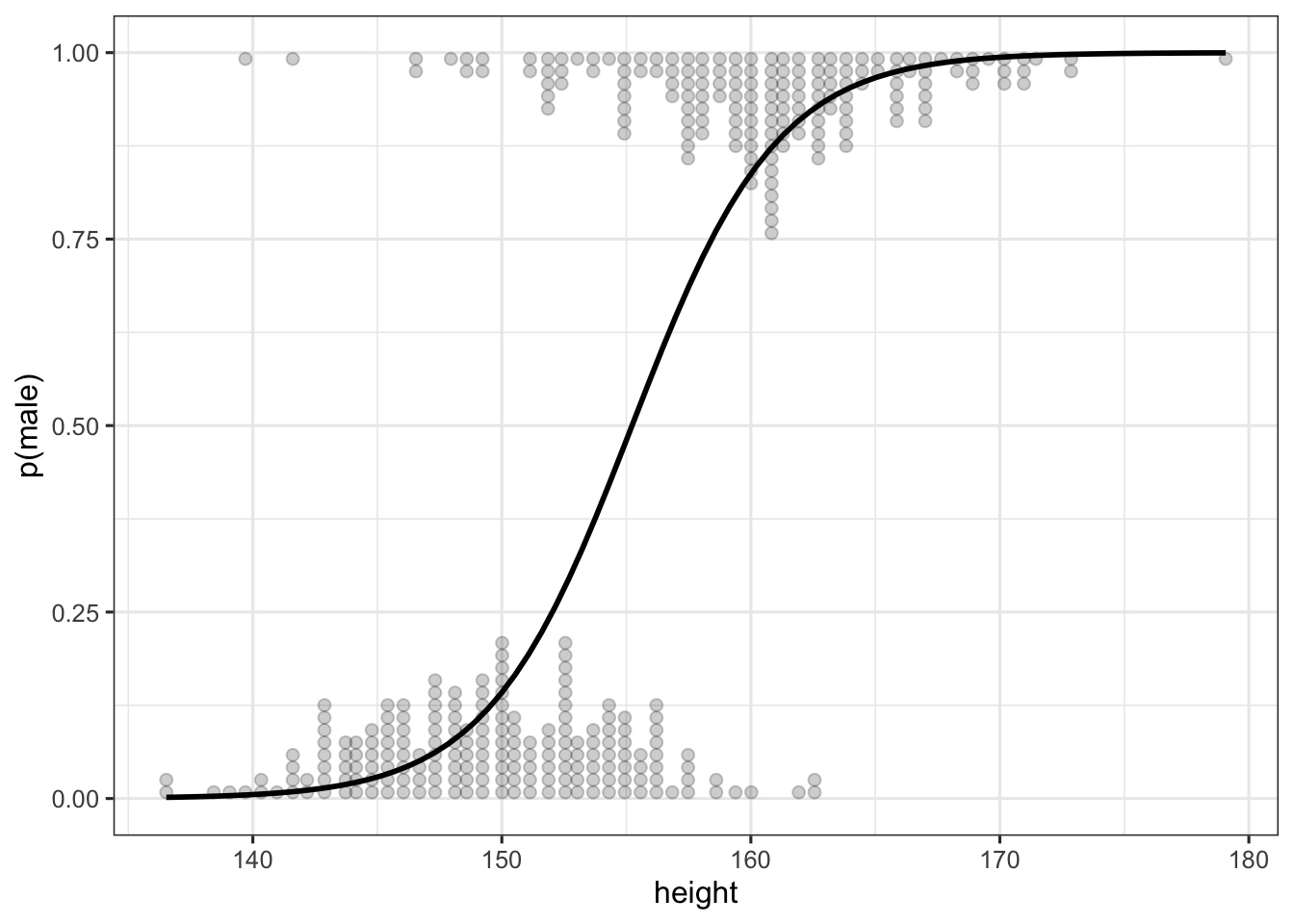
The current default plot for logistic models is like that:
However, when the outcome variable is not on the 0-1 scale, but is a factor (and thus 1-2 by default), the plot is messed up:
Created on 2021-06-09 by the reprex package (v1.0.0)
What would be the most elegant solution to plot the line on the outcome's scale?
On a related note, I'm thinking about moving from a pseudo-rug geoms for data points towards maybe something that would look like this:
What's the best way to create something like that? Using ggdists?
The text was updated successfully, but these errors were encountered: