-
Notifications
You must be signed in to change notification settings - Fork 782
New issue
Have a question about this project? Sign up for a free GitHub account to open an issue and contact its maintainers and the community.
By clicking “Sign up for GitHub”, you agree to our terms of service and privacy statement. We’ll occasionally send you account related emails.
Already on GitHub? Sign in to your account
User interface improvements #1202
Comments
|
Thanks for reporting!
This is a regression from #1182, that I didn't notice. I'll fix this. I agree about the toolbars, but unfortunately there's no fasttrack solution. Qt doesn't support GNOME's Header Bars, and even if it did, that would have been GNOME specific. My quick attempt to make the menu bar show and hide on Alt was not very successful. For some reason hiding the menu bar also steals focus from the current widget, and also any Alt+ combinations do not work while the menu bar is invisible. At some point I was considering implementing a custom UI a la VS Code, but that'd be a enormous amount of work, and designing interfaces is not my strong suit as you can see. So, lately the medium term plan has been to move all core logic to a standalone headless service, that native UI apps can use. Unfortunately, Qt is not what it used to be, and it can't effectively play the catch up game with the modern operating systems changing their UI/UX practices in every update. That leaves us with only two viable options, either multiple native UI apps, or a single cross platform with its own UI. |
|
Thank you for the clarifications! I think that the plan to move the core logic into a standalone service that can be used by native apps is a brilliant one. I would be happy to contribute to building a GTK UI following the HIG for Linux, but I understand that it might be tricky to build a Windows UI. I understand that Zeal and Dash share docsets, but I'm not too sure how different they are under the hood. It would be kind of awesome if the core could be shared across all platforms, and if Dash becomes a Mac frontend for the unified service. @Kapeli, what do you think? @trollixx Do you have a plan for how to start extracting functionality into a separate service? I can see that there's a |
A regression from switching to serving content over HTTP.

Reported in #1202.
Fixed in c2acb42, please test. |
Just tested and it is fixed. Thank you very much! |
|
[Alt] focuses the menu bar, thus preventing [Alt] combinations from working. It does not highlight the menu entry selected nor open any of the drop-down menus though, which makes it seem as if nothing happened. To verify: press either the up or down arrow key or a top-level accelerator hotkey (such as Alt and then any of [F]ile, [E]dit, [T]ools, or [H]elp). I believe merging pull request #1441 should address the issue, also reducing issue #1251. |

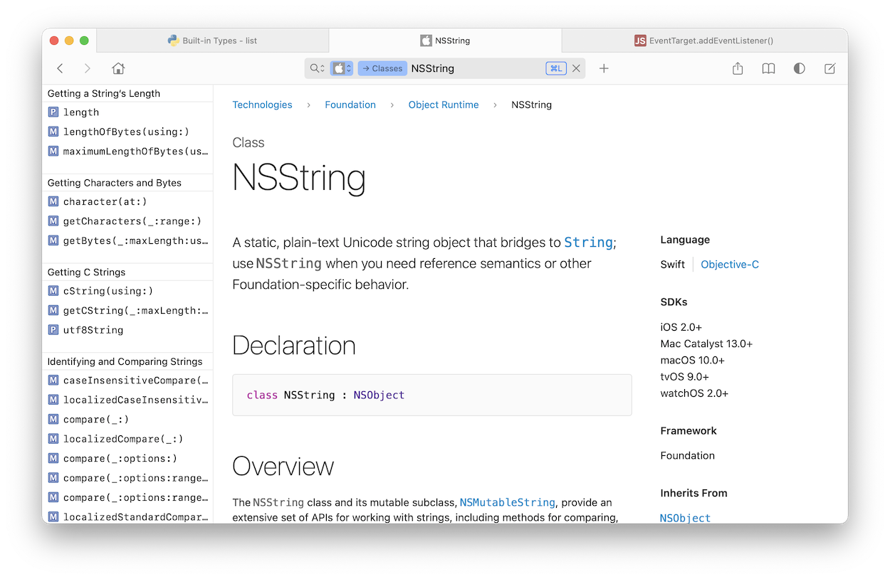
Hello! I love Zeal, and I would love to see some user interface improvements in it.
For example, in this screenshot, several things could be improved:
Altkey. As the menu bar doesn't expose any essential functionality, this could be a good way to get started.I'm happy to try to contribute code, but I don't know the first thing about Qt, so I might need some help to get started on this.
Edit: Forgot to mention that this screenshot is from the
zeal-gitpackage on the AUR, running under Gnome.The text was updated successfully, but these errors were encountered: