Release 1.6.0
- New:
MahApps.Metro.Styles.MetroWatermarkTextBlockstyle to make it easier to set custom properties likeFontFamilyorFontSizefor all Watermarks. - New: Replacing
WindowChromeand related things with reference toControlzEx#3021 -
NumericUpDown- New:
SnapToMultipleOfIntervalproperty forNumericUpDownwhich indicates if theNumericUpDownshould round the value to the nearest possible interval when the focus moves to another element. #2952 @xxMUROxx - New:
NumericInputModeproperty with the new flag enumerationNumericInput(default isNumericInput.All) - Mark
HasDecimalsas obsolete - Block scientific input if only numbers allowed
- Fix:
NumericUpDown,HotKeyBoxandTimerPickerBasedoesn't focus for the first time when the FocusManager will be used.
- New:
- New: Changing popup border thickness and padding for
ComboBoxvia resource keys-
ComboBoxBorderThemeThickness(default 1) -
ComboBoxPopupBorderThemeThickness(default 1) -
ComboBoxPopupBorderThemePadding(default 1)
-
- New: Changing the header padding for
GroupBoxandExpandervia resource keys-
GroupBoxHeaderThemePadding(default 4) -
ExpanderHeaderThemePadding(default 2) -
ExpanderToggleButtonEllipseThemeSize(default 18)
-
- New:
Badgedcontrol has now a different look when disabled. thx @xxMUROxx- New brush for light and dark themes:
MahApps.Metro.Brushes.Badged.DisabledBackgroundBrush
- New brush for light and dark themes:
-
Watermark- Use
TextBoxHelper.WatermarkforHotKeyBoxinstead own DependencyProperty (marked as obsolete). - Allow
TextBoxHelper.AutoWatermarkforHotKeyDependencyProperty ofHotKeyBox. - New:
TextBoxHelper.WatermarkTrimmingattached property to set the text trimming behavior to employ when (floating) watermark overflows the content area. thx to @amkuchta - New:
TextBoxHelper.WatermarkWrappingattached property (only forTextBox) to set how the watermark should wrap text. Default is binded toTextWrappingproperty. thx to @amkuchta
- Use
-
VS Theme- New:
StandardGroupBoxstyle - New:
StandardExpanderstyle
- New:
-
TabControlHelper- New:
TabControlHelper.CloseButtonEnabledattached property to show / hide the close button (default is true). - New:
TabControlHelper.CloseTabCommandattached property which executes if theTabItemwill be closed. - New:
TabControlHelper.CloseTabCommandParameterattached property which will be passed to theCloseTabCommand.
- New:
- New: Add
TextBoxHelper.ButtonsAlignmentsupport forPasswordBoxstyles #3074 @waleswood - New:
MetroHeadercontrol which can contains any other content and can display a header on top of this content.
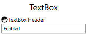
<Controls:MetroHeader Margin="2" Header="TextBox Header"> <Controls:MetroHeader.HeaderTemplate> <DataTemplate> <StackPanel VerticalAlignment="Center" Orientation="Horizontal"> <iconPacks:PackIconMaterial VerticalAlignment="Center" Kind="FaceProfile" /> <TextBlock Margin="2 0 0 0" VerticalAlignment="Center" Text="{Binding}" /> </StackPanel> </DataTemplate> </Controls:MetroHeader.HeaderTemplate> <TextBox Text="Enabled" /> </Controls:MetroHeader> - New:
ScrollViewerHelperclass- New:
IsHorizontalScrollWheelEnabledattached property. If it's set to true and a horizontalScrollBaris visible then the mouse wheel scrolls to left and right. - Change:
VerticalScrollBarOnLeftSideattached property fromScrollBarHelpertoScrollViewerHelper. ScrollBarHelper is now marked as obsolete.
- New:
- New: Use
FlatButtonForegroundBrushin the newMahApps.Metro.Styles.FlatButtonFocusVisualStylewhich is used now forMetroFlatButtonandMetroFlatToggleButton -
PasswordBoxHelper- New:
RevealButtonContentandRevealButtonContentTemplateattached properties - Set the
DefaultRevealButtonIconContentControl toRevealButtonContentattached property
- New:
- Change: Use the original Win 10 close button style
- New:
MahApps.Metro.Styles.WindowButton.Close.Light.Win10andMahApps.Metro.Styles.WindowButton.Close.Dark.Win10styles


- New:
- New:
ItemHelperclass with someBrushattached properties for mouse interaction. These properties can be used withHamburgerMenuItem,ListBoxItem,ListViewItem,TreeViewItemandComboBoxItem.-
ItemHelper.ActiveSelectionBackgroundBrushdefaultAccentColorBrush -
ItemHelper.ActiveSelectionForegroundBrushdefaultAccentSelectedColorBrush -
ItemHelper.DisabledBackgroundBrushdefaultx:Null -
ItemHelper.DisabledForegroundBrushdefaultGrayNormalBrush -
ItemHelper.DisabledSelectedBackgroundBrushdefaultGrayBrush7 -
ItemHelper.DisabledSelectedForegroundBrushdefaultAccentSelectedColorBrush -
ItemHelper.HoverBackgroundBrushdefaultAccentColorBrush3 -
ItemHelper.HoverSelectedBackgroundBrushdefaultAccentColorBrush -
ItemHelper.SelectedBackgroundBrushdefaultAccentColorBrush2 -
ItemHelper.SelectedForegroundBrushdefaultAccentSelectedColorBrush
-
-
ToggleSwitch- New:
ContentPaddingdependency property to change the padding of the inner content in an easy way.
- New:
-
HamburgerMenu- Renaming (internal used styles):
-
HamburgerListBoxItemStyle->HamburgerMenuItemStyle -
HamburgerListBoxStyle->HamburgerMenuListStyle
-
- Revert back to
UWPCommunityToolkitstyle (update template to keep options visible)- Move template to
HamburgerMenuTemplateresource dictionary - Add margins
- Vertically stretch the menu items of the hamburger menu
- Move template to
- Change inner ListBox scrolling (to CanContentScroll)
- New: Add
ItemContainerStyleandOptionsItemContainerStyleproperties. This makes it easier to change the inner styles for the items (and option items) - MinHeight of the menu items should be
0 - Change:
HamburgerMenuImageItem: Downgrade thumbnail property fromBitmapImageto subclassImageSource - New: Introduce
ItemInvokedevent (as an alternative toItemClickandOptionsItemClick) - New:
SelectionIndicator(rectangle) which can be enabled with the newShowSelectionIndicatordependency property- New: resource key
HamburgerMenuSelectionIndicatorThemeWidthdefault6 - New: resource key
HamburgerMenuSelectionIndicatorThemeHeightdefault24
- New: resource key
- Improved item
FocusVisualStyle- Add new (readonly)
ItemFocusVisualStyledependency property which will be re-created if one of these properties are changed:OpenPaneLength,CompactPaneLengthandIsPaneOpen. Default template isHamburgerMenuItemFocusVisualTemplate. - This FocusVisualStyle can be override at the
HamburgerMenuItemstyle by setting theFocusVisualStyleproperty.
- Add new (readonly)
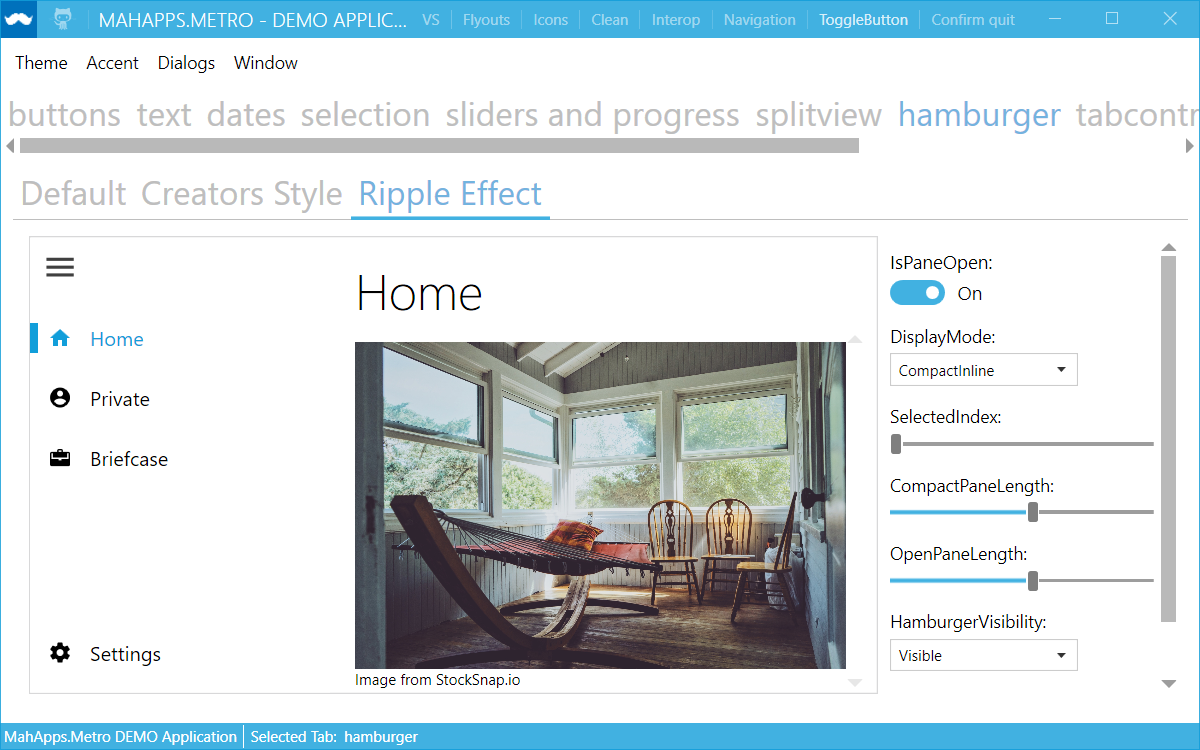
- Change: Reorganize Hamburger sample: shows now Default style, Creators Update style and a sample with the MaterialDesignInXaml Ripple control
- Fix: Set a selected Item only if there is no content set
- Add
HamburgerMenuresources to Control styles to allow style manipulation and fix binding expression infos - Fix:
PanePlacementhandling for right aligned - New: Add
ToolTipDependencyPropertyforHamburgerMenuItem


- Renaming (internal used styles):
-
Dialogs- New: Create new style for Dialogs
MahApps.Metro.Styles.MetroDialogand set this as default - Add
BaseMetroDialogresources to Control styles to allow easier dialog style manipulation - Fix: Do not load all MahApps styles in code behind again (this is not necessary anymore, since it's now at Style level too)
- Fix: Inverted Dialogs theme (the background wasn't correct)
- New: Add
ProgressDialogController.SetProgressBarForegroundBrush(Brush)so that you can customize a progress dialog's progress bar foreground Brush.
- New: Create new style for Dialogs
-
MetroWindow(Dialogs)- Add a new (readonly)
IsAnyDialogOpendependency property. This property will be updated if a dialog is shown or not. - New:
OwnerCanCloseWithDialogproperty atMetroDialogSettingswhich can be used to handle how the owner of the dialog can be closed. - New:
IsCloseButtonEnabledWithDialogproperty atMetroWindowwhich indicates if the close button should be enabled or not if a dialog is shown. - The
HandleOverlayOnHideandHandleOverlayOnShowmethods sets theIsCloseButtonEnabledWithDialogPropertyKeyand restores focus if needed - New:
OverlayFadeInandOverlayFadeOutproperties to set/override the overlay fade in/out Storyboards which are used for theDialogs - Fix: Fade in and out animation was wrong if no duration exists
- Fix:
HideMetroDialogAsyncfails sometimes to close dialog (async call order)
- Add a new (readonly)
- New: Win10
Sliderstyle:MahApps.Metro.Styles.Slider.Win10- Control template:
MahApps.Metro.Styles.Slider.HorizontalTemplate.Win10,MahApps.Metro.Styles.Slider.VerticalTemplate.Win10 - RepeatButton:
MahApps.Metro.Styles.Slider.HorizontalTrack.Win10,MahApps.Metro.Styles.Slider.VerticalTrack.Win10 - Thumb:
MahApps.Metro.Styles.Slider.Thumb.Win10


- Control template:
- New: Normal
Sliderstyle:MahApps.Metro.Styles.Slider(mark old as obsolete)- Control template:
MahApps.Metro.Styles.Slider.HorizontalTemplate,MahApps.Metro.Styles.Slider.VerticalTemplate - RepeatButton:
MahApps.Metro.Styles.Slider.HorizontalTrack,MahApps.Metro.Styles.Slider.VerticalTrack - Thumb:
MahApps.Metro.Styles.Slider.Thumb
- Control template:
- New: Win10
RangeSliderstyle:MahApps.Metro.Styles.RangeSlider.Win10- Control template:
MahApps.Metro.Styles.RangeSlider.HorizontalTemplate.Win10,MahApps.Metro.Styles.RangeSlider.VerticalTemplate.Win10 - RepeatButton:
MahApps.Metro.Styles.Slider.HorizontalTrack.Win10,MahApps.Metro.Styles.Slider.VerticalTrack.Win10 - Thumb:
MahApps.Metro.Styles.Slider.Thumb.Win10,MahApps.Metro.Styles.RangeSlider.HorizontalMiddleThumb.Win10,MahApps.Metro.Styles.RangeSlider.VerticalMiddleThumb.Win10

- Control template:
- New: Normal
RangeSliderstyle:MahApps.Metro.Styles.RangeSlider- Use
SliderHelperbrush properties also forRangeSlider - Thump styles for the middle part:
MahApps.Metro.Styles.RangeSlider.HorizontalMiddleThumb,MahApps.Metro.Styles.RangeSlider.VerticalMiddleThumb - Use
MetroThumbinsteadThumb - Set
ReservedSpacefor allTickBarcontrols insteadMargin
- Use
-
SliderHelper: Add new attached properties for all possibleBrushes- Allow
SliderHelper.EnableMouseWheelandSliderHelper.ChangeValueByforRangeSlidertoo. - Default Win10
Sliderbrushes-
SliderHelper.ThumbFillBrushdefaultAccentBaseColorBrush -
SliderHelper.ThumbFillHoverBrushdefaultGrayBrush3 -
SliderHelper.ThumbFillPressedBrushdefaultAccentBaseColorBrush -
SliderHelper.ThumbFillDisabledBrushdefaultGrayBrush1 -
SliderHelper.TrackFillBrushdefaultGrayBrush2 -
SliderHelper.TrackFillHoverBrushdefaultAccentBaseColorBrush -
SliderHelper.TrackFillPressedBrushdefaultGrayBrush6 -
SliderHelper.TrackFillDisabledBrushdefaultGrayBrush3 -
SliderHelper.TrackValueFillBrushdefaultAccentBaseColorBrush -
SliderHelper.TrackValueFillHoverBrushdefaultGrayBrush6 -
SliderHelper.TrackValueFillPressedBrushdefaultGrayBrush6 -
SliderHelper.TrackValueFillDisabledBrushdefaultGrayBrush6
-
- Default
Sliderbrushes-
SliderHelper.ThumbFillBrushdefaultGrayBrush2 -
SliderHelper.ThumbFillHoverBrushdefaultGrayBrush3 -
SliderHelper.ThumbFillPressedBrushdefaultAccentColorBrush -
SliderHelper.ThumbFillDisabledBrushdefaultGrayBrush5 -
SliderHelper.TrackFillBrushdefaultGrayBrush3 -
SliderHelper.TrackFillHoverBrushdefaultAccentColorBrush -
SliderHelper.TrackFillPressedBrushdefaultGrayBrush2 -
SliderHelper.TrackFillDisabledBrushdefaultGrayBrush3 -
SliderHelper.TrackValueFillBrushdefaultAccentColorBrush -
SliderHelper.TrackValueFillHoverBrushdefaultGrayBrush6 -
SliderHelper.TrackValueFillPressedBrushdefaultGrayBrush6 -
SliderHelper.TrackValueFillDisabledBrushdefaultGrayBrush6
-
- Allow
-
DatePicker- New: Add new dependency property
ControlsHelper.IsReadOnly. This property sets theIsReadOnlyproperty on the innerTextBoxand theIsEnabledon the inner popup button.
- New: Add new dependency property
MahApps will no longer be strong-named beginning with this version. #3029
Why?
Strong-named assemblies are only useful in some rare scenarios. If you need strong-named assembly then you can compile the source by yourself ore use the Strong Namer from Daniel Plaisted @dsplaisted or Strong-Name Signer from Werner van Deventer @brutaldev.
More informations about the reason of this decision can be found here:
- Still Strong-Naming your Assemblies? You do know it’s 2016, right?
- XAML Behaviors UWP Managed 1.1.0
- Strong-Named Assemblies
-
69afa65e Adopt
SpellCheck.IsEnabledchanges fromMaterialDesignInXamlToolkit@ButchersBoy #650 Removes the extra hidden classes and enables flexible style changes, it's more WPF now. -
15bbe66d Inherit FontFamily and FontSize for
CalendarDayButtonandCalendarButtonfromCalendar. -
2c97fd4e Fix: Brushes for
MetroProgressBar - 5c4471c3 Use DynamicResource for all brushes and freeze it too.
-
8c0f893f Fix:
MetroProgressBardoes not work inside ControlTemplate -
c900c5bd Check for RootVisual in
GlowWindowBehavior -
ad16dc30
ResizeBorderThicknessmust also be set to 0 on maximize -
6943cc92 Use
PropertyChangeNotifierfromControlzEx -
7ea7a7c7 Removing trigger for
ResizeBorderThicknessas it's handled byControlzEx -
44c23637 Fix possible System.Windows.Data warning for
ComboBoxItem, if aComboBoxis inside aContentControl. -
edc34679
FlipView: BindItemStringFormattoContentStringFormat -
2c1c692b Fix not updating the text of
TimePickerandDateTimePickerafter changing the culture -
e54aaaf1 Use
DialogTitleFontSizeandDialogMessageFontSizevia DynamicResource at the base MetroDialog style - 9071379b Closing main demo was wrong (TaskCanceledException)
-
4253d89f Set
HorizontalScrollBarVisibilityandVerticalScrollBarVisibilityforHotKeyBoxandNumericUpdDownto Hidden, cause the inner TextBox has this as default too -
713cb69b
Slider: remove linear gradient brush from horizontal and vertical track value style.RangeSlider: fix margin of the middle thumb.