CountryCodePickerTextField
This is the OutlinedTextField composable. You can customize it as a regular OutlinedTextField composable. This already has the CountryCodePicker composable inside it. So, you don't need to use the CountryCodePicker composable separately. But if you want the automatic country detection feature, you need to add some lines with the CountryCodePickerTextField composable.
var country by remember {
mutableStateOf(Country.Bangladesh)
}
// If you want to get the country automatically
if (!LocalInspectionMode.current) {
CCPUtils.getCountryAutomatically(context = LocalContext.current).let {
it?.let {
country = it
}
}
}
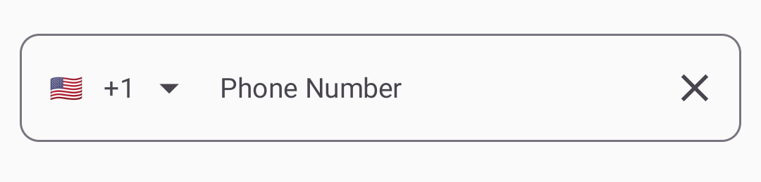
CountryCodePickerTextField(
modifier = Modifier
.fillMaxWidth()
.padding(10.dp),
enabled = true,
textStyle = MaterialTheme.typography.bodyMedium,
trailingIcon = {
IconButton(onClick = { text = "" }) {
Icon(
imageVector = Icons.Default.Clear, contentDescription = "Clear"
)
}
},
label = {
Text(
text = "Phone Number", style = MaterialTheme.typography.bodyMedium
)
},
showError = true,
shape = RoundedCornerShape(10.dp),
onValueChange = { _, value, _ ->
text = value
},
number = text,
showSheet = true,
selectedCountry = country
)
@Composable
fun CountryCodePickerTextField(
    modifier: Modifier = Modifier,
    number: String,
    onValueChange: (countryCode: String, value: String, isValid: Boolean) -> Unit,
    enabled: Boolean = true,
    textStyle: TextStyle = LocalTextStyle.current,
    label: @Composable (() -> Unit)? = null,
    placeholder: @Composable (() -> Unit)? = null,
    trailingIcon: @Composable (() -> Unit)? = null,
    showError: Boolean = true,
    keyboardOptions: KeyboardOptions = KeyboardOptions.Default,
    keyboardActions: KeyboardActions = KeyboardActions.Default,
    shape: Shape = RoundedCornerShape(10.dp),
    colors: TextFieldColors = OutlinedTextFieldDefaults.colors(),
    selectedCountry: Country = Country.Bangladesh,
    countryList: List<Country> = Country.getAllCountries(),
    viewCustomization: ViewCustomization = ViewCustomization(),
    pickerCustomization: PickerCustomization = PickerCustomization(),
    backgroundColor: Color = MaterialTheme.colorScheme.background,
    showSheet: Boolean = false,
    itemPadding: Int = 10,
)You can learn about the viewCustomization and pickerCustomization from the Utils