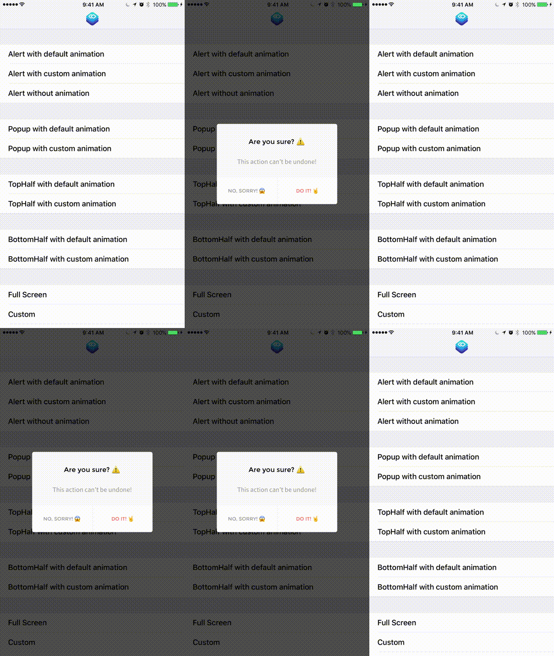
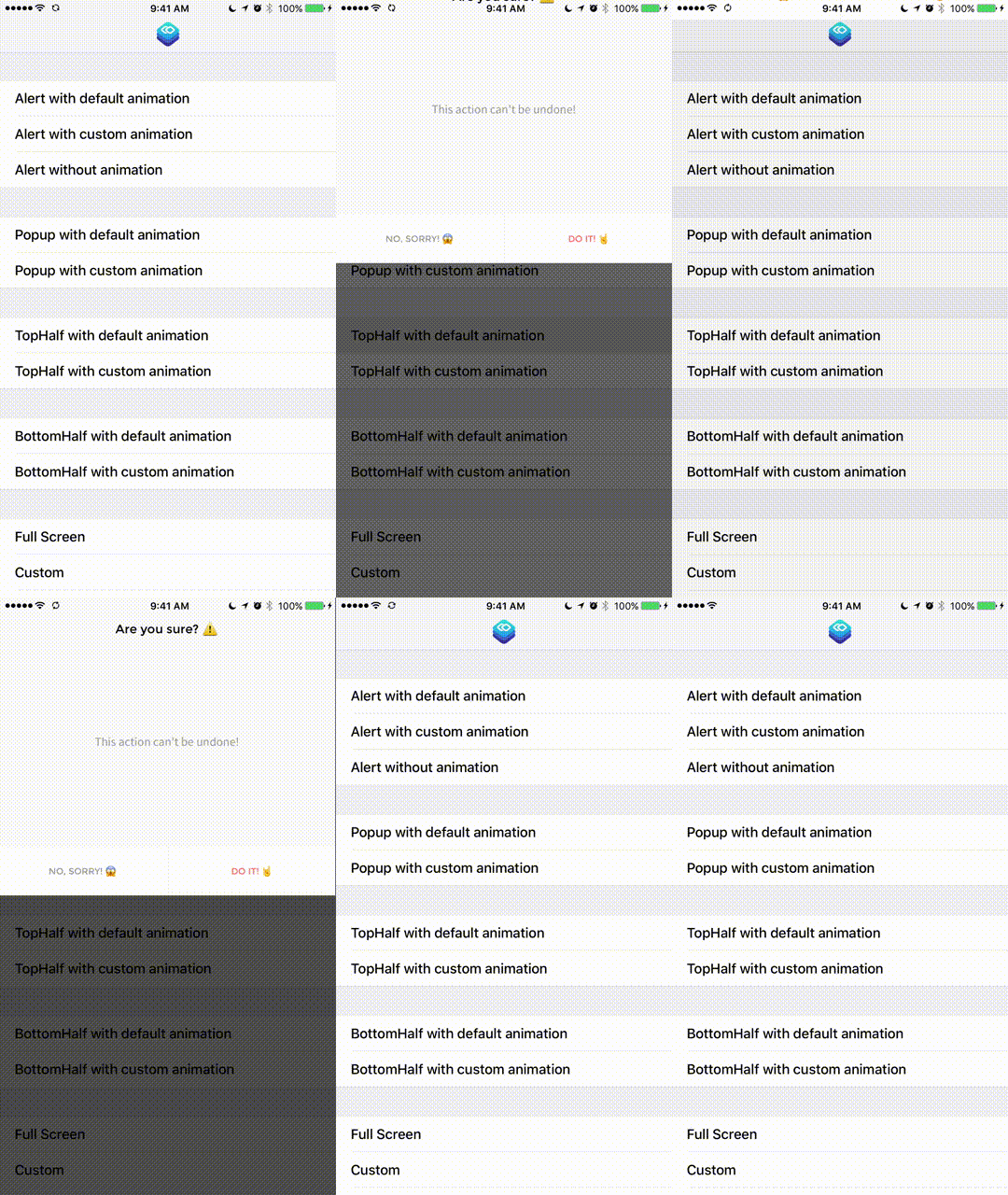
Presentr is a simple customizable wrapper for the Custom View Controller Presentation API introduced in iOS 8.
iOS let's you modally present any view controller, but if you want the presented view controller to not cover the whole screen or modify anything about its presentation or transition you have to use the Custom View Controller Presentation API's.
This can be cumbersome, specially if you do it multiple times in your app. Presentr simplifies all of this. You just have to configure Presentr depending on how you want you view controller to be presented, and the framework handles everything for you.
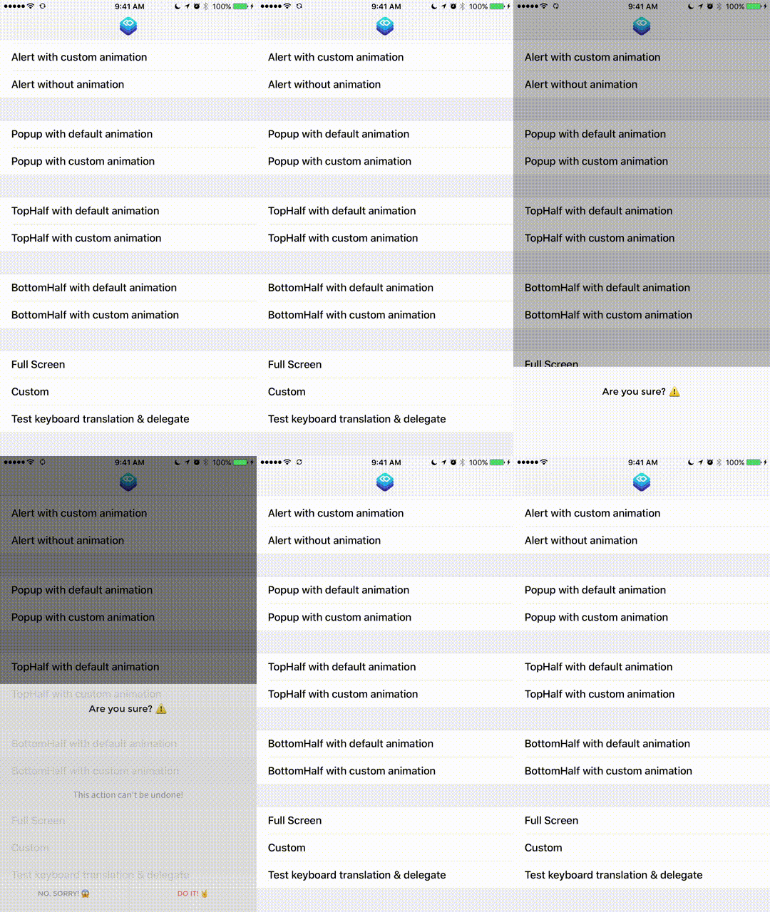
These are just examples of an Alert UI presented in multiple ways. But, with Presentr you can present any custom View Controller you create in any of the Presentation types, or create your own custom one!
- You are now able to create your own custom transition animations. See how in readme. (thanks to @fpg1503 & @danlozano)
- New animation available, coverVerticalWithSpring (thanks to @fpg1503)
- Support for animated blurred background (thanks to @fpg1503)
- New ModalSize option with sideMargin value (thanks to @alediaz84)
- Example project fixes
- Support for custom radius & drop shadow (thanks @falkobuttler)
- New fluid percentage option for ModalSize enum (thanks @mseijas)
- Example project and other general improvements (thanks @gabrielPeart)
- Fork project
- Checkout Develop branch
- Create Feature branch off of the Develop branch
- Create awesome feature/enhancement/bug-fix
- Optionally create Issue to discuss feature
- Submit pull request from your Feature branch to Presentr’s Develop branch
| Presentr Version | Swift Version | Min. iOS Version |
|---|---|---|
| <= 0.1.8 | Swift 2.2 | >= iOS 8.0 |
| == 0.2.1 | Swift 2.3 | >= iOS 8.0 |
| >= 1.0.0 | Swift 3.0 | >= iOS 9.0 |
use_frameworks!

pod 'Presentr'Add Presentr to you Cartfile
github "IcaliaLabs/Presentr"Install using
carthage update --platform ios- Download and drop
/Presentrfolder in your project. - You're done!
It is important to hold on to the Presentr object as a property on the presenting/current View Controller since internally it will be used as a delegate for the custom presentation, so you must hold a strong reference to it.
class ViewController: UIViewController{

  let presenter: Presentr = {
      let presenter = Presentr(presentationType: .alert)
      presenter.transitionType = .coverHorizontalFromRight // Optional
      return presenter
  }()

}Instantiate the View Controller you want to present. Remember to setup autolayout on it so it can be displayed well on any size.
let controller = SomeViewController()
customPresentViewController(presenter, viewController: controller, animated: true, completion: nil)
This is a helper method provided for you as an extension on UIViewController. It handles setting the Presentr object as the delegate for the presentation & transition.
The PresentationType (and all other properties) can be changed later on in order to reuse the Presentr object for other presentations.
presenter.presentationType = .popuppublic enum PresentationType {
case alert
case popup
case topHalf
case bottomHalf
case fullScreen
case custom(width: ModalSize, height: ModalSize, center: ModalCenterPosition)
}public enum TransitionType{
// System provided
case coverVertical
case crossDissolve
case flipHorizontal
// Custom
case coverVerticalFromTop
case coverHorizontalFromRight
case coverHorizontalFromLeft
case coverVerticalWithSpring
// User Provided
case custom(PresentrAnimation)
}You can choose a TransitionType, which is the animation that will be used to present or dismiss the view controller.
presenter.transitionType = .coverVerticalFromTop
presenter.dismissTransitionType = .coverVertical
You can change the background color & opacity for the background view that will be displayed below the presented view controller. Default is black with 0.7 opacity.
presenter.backgroundColor = UIColor.red
presenter.backgroundOpacity = 1.0
You could also turn on the blur effect for the background, and change it's style. Default is false for the blur effect, and .Dark for the style. If you turn on the blur effect the background color and opacity will be ignored.
presenter.blurBackground = true
presenter.blurStyle = UIBlurEffectStyle.light
You can choose to disable rounded corners on the view controller that will be presented. Default is true.
presenter.roundCorners = falseYou can also set the cornerRadius if you set roundCorners to true.
presenter.cornerRadius = 10Using the PresentrShadow struct can set a custom shadow on the presented view controller.
let shadow = PresentrShadow()
shadow.shadowColor = .black
shadow.shadowOpacity = 0.5
shadow.shadowOffset = CGSize(5,5)
shadow.shadowRadius = 4.0

presenter.dropShadow = shadow
You can choose to disable dismissOnTap that dismisses the presented view controller on tapping the background. Default is true. Or you can disable the animation for the dismissOnTap.
presenter.dismissOnTap = false
presenter.dismissAnimated = false
You can activate dismissOnSwipe so that swiping up inside the presented view controller dismisses it. Default is false. If your view controller uses any kind of scroll view this is not recommended as it will mess with the scrolling.
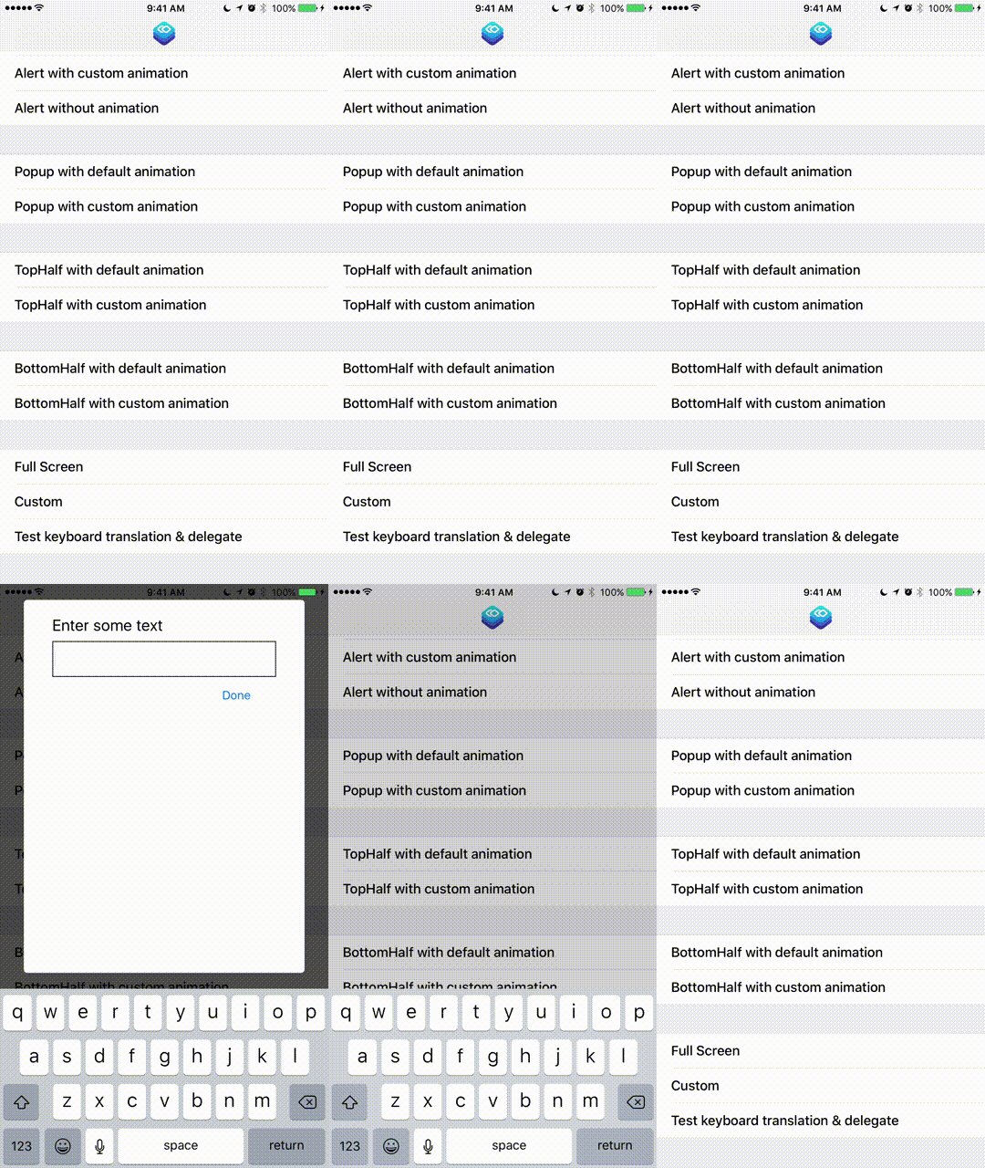
presenter.dismissOnSwipe = trueIf you have text fields inside your modal, you can use a KeyboardTranslationType to tell Presentr how to handle your modal when the keyboard shows up.
presenter.keyboardTranslationType = .none
presenter.keyboardTranslationType = .moveUp
presenter.keyboardTranslationType = .compress
presenter.keyboardTranslationType = .stickToTopYou can conform to the PresentrDelegate protocol in your presented view controller if you want to get a callback. Using this method you can prevent the view controller from being dismissed when the background is tapped and/or perform something before it's dismissed.
func presentrShouldDismiss(keyboardShowing: Bool) -> Bool { }- Create a class that inherits from PresentrAnimation, and override the properties you want to modify.
- Note the transform method. It receives the Container Frame and Final Frame of the presented view controller. You need to return the Initial frame you want for the view controller, that way you can create your animation.
class CustomAnimation: PresentrAnimation {

    override var springDamping: CGFloat {
        return 500
    }

    override var initialSpringVelocity: CGFloat {
        return 1
    }

    override var animationDuration: TimeInterval {
        return 1
    }

    override func transform(containerFrame: CGRect, finalFrame: CGRect) -> CGRect {
        return CGRect(x: 0, y: 0, width: 10, height: 10)
    }

}
If modifying those properties is not enough, you can handle the animation completely by yourself overriding this method.
override func customAnimation(using transitionContext: UIViewControllerContextTransitioning) -> Bool {
  // Do your custom animation here, using the transition context.
  return true
}
Remember to return true otherwise your custom animation will be ignored. If you implement this method and return true, other properties will be obviously ignored.
Finally, create a custom TransitionType with your custom animation.
presenter.transitionType = .custom(CustomAnimation())If you need to present a controller in a way that is not handled by the 4 included presentation types you can create your own. You create a custom PresentationType using the .Custom case on the PresentationType enum.
let customType = PresentationType.custom(width: width, height: height, center: center)It has three associated values for the width, height and center position of the presented controller. For setting them we use two other enums.
// This is used to calculate either a width or height value.
public enum ModalSize {
  case default
  case half
  case full
  case custom(size: Float)
  case fluid(percentage: Float)
}

// This is used to calculate the center point position for the modal.
public enum ModalCenterPosition {
  case center
  case topCenter
  case bottomCenter
  case custom(centerPoint: CGPoint)  // Custom fixed center point.
  case customOrigin(origin: CGPoint) // Custom fixed origin point.
}
This allows us to use a fixed value when we want
let width = ModalSize.custom(size: 300) // Custom 300pt widthBut also let Presentr handle the calculations when we want something more common.
let height = ModalSize.full // Whole screen heightWe could also set a fixed position
let position = ModalCenterPosition.custom(centerPoint: CGPoint(x: 150, y: 150)) // Custom center pointOr let presentr calculate the position
let position = ModalCenterPosition.center // Center of the screenSo we can mix and match, and have the benefit of a custom PresentationType but still have Presentr calculating the values we don't want to do ourselves. The following code creates a Presentr object with a custom PresentationType which shows the alert in a small top banner.
class ViewController: UIViewController{

  let customPresenter: Presentr = {

    let width = ModalSize.full
    let height = ModalSize.custom(size: 150)
    let center = ModalCenterPosition.customOrigin(origin: CGPoint(x: 0, y: 0))

    let customType = PresentationType.custom(width: width, height: height, center: center)

    let customPresenter = Presentr(presentationType: customType)
    customPresenter.transitionType = .coverVerticalFromTop
    customPresenter.roundCorners = false
    return customPresenter

  }()

}Presentr also comes with a cool AlertViewController baked in if you want something different from Apple's. The API is very similar to Apple's alert controller.
  let title = "Are you sure?"
  let body = "There is no way to go back after you do this!"

  let controller = Presentr.alertViewController(title: title, body: body)

  let deleteAction = AlertAction(title: "Sure 🕶", style: .destructive) {
    print("Deleted!")
  }

  let okAction = AlertAction(title: "NO, sorry 🙄", style: .cancel){
    print("Ok!")
  }

  controller.addAction(deleteAction)
  controller.addAction(okAction)

  presenter.presentationType = .alert
customPresentViewController(presenter, viewController: controller, animated: true, completion: nil)- iOS 9.0+
- Xcode 8.0+
- Swift 3.0+
Read the docs. Generated with jazzy.
Gabriel Peart
Logo design by Eduardo Higareda
Alert design by Noe Araujo
Presentr is released under the MIT license.
See LICENSE for details.


