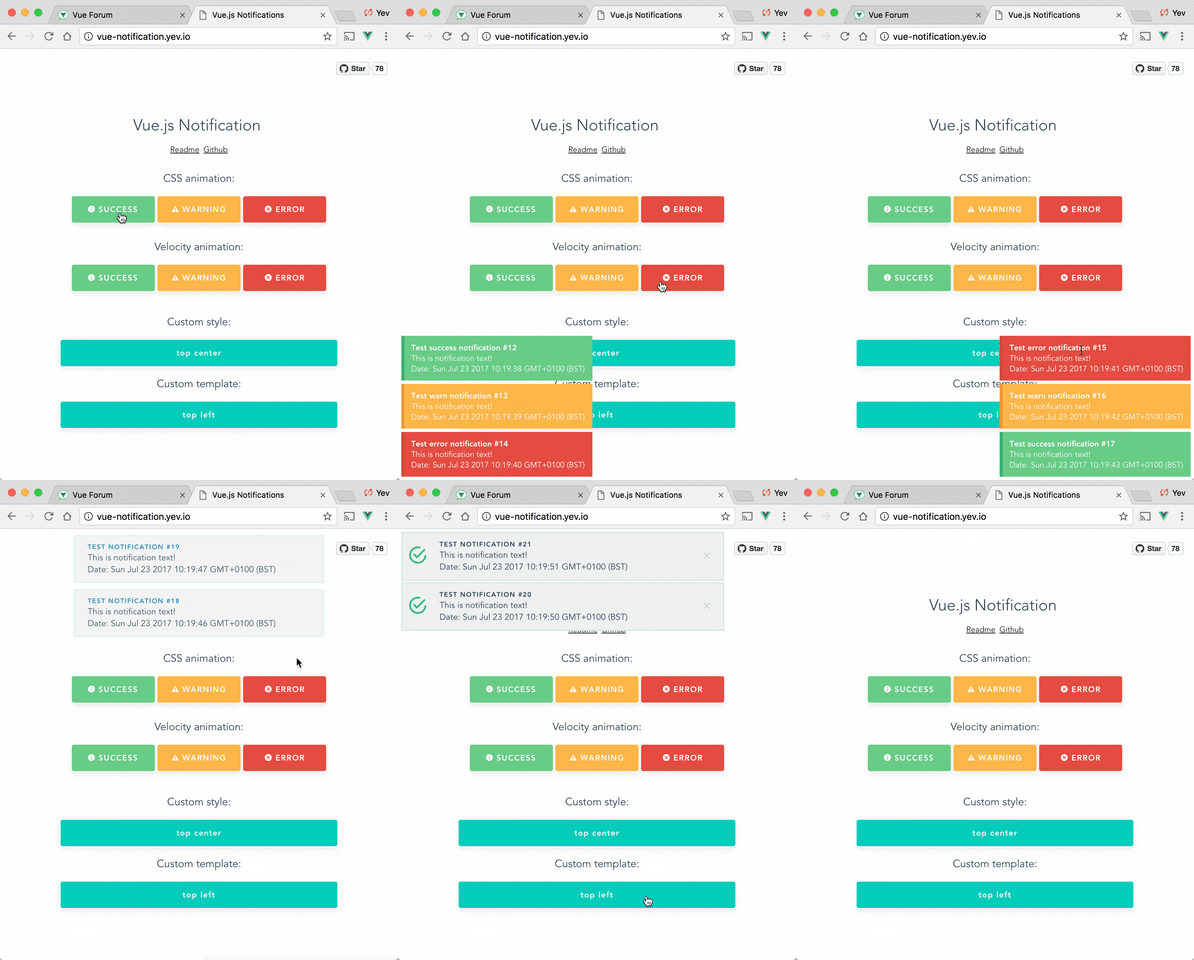
Demo: http://vue-notification.yev.io/
npm install --save vue-notificationIn main.js:
import Vue           from 'vue'
import Notifications from 'vue-notification'

/*
or for SSR:
import Notifications from 'vue-notification/dist/ssr.js'
*/

Vue.use(Notifications)
In App.vue:
<notifications group="foo" />In any of your vue files:
this.$notify({
  group: 'foo',
  title: 'Important message',
  text: 'Hello user! This is a notification!'
});
Anywhere else:
import Vue from 'vue'

Vue.notify({
  group: 'foo',
  title: 'Important message',
  text: 'Hello user! This is a notification!'
})All configurations are optional.
| Name | Type | Default | Description |
|---|---|---|---|
| name | String | notify | Defines the instance name. It's prefixed with the dollar sign. E.g. $notify |
| componentName | String | notifications | The component's name |
P.S. Setting componentName can cause issues when using SSR.
All props are optional.
| Name | Type | Default | Description |
|---|---|---|---|
| group | String | null | Name of the notification holder, if specified |
| type | String | null | Class that will be assigned to the notification (warn, error, success, etc) |
| width | Number/String | 300 | Width of notification holder, can be %, px string or number.Valid values: '100%', '200px', 200 |
| classes | String/Array | 'vue-notification' | List of classes that will be applied to notification element |
| position | String/Array | 'top right' | Part of the screen where notifications will pop out |
| animation-type | String | 'css' | Type of animation, currently supported types are css and velocity |
| animation-name | String | null | Animation name required for css animation |
| animation | Object | $* |
Animation configuration for Velocity animation |
| duration | Number | 3000 | Time (ms) animation stays visible (if negative - notification will stay forever or until clicked) |
| speed | Number | 300 | Speed of animation showing/hiding |
| max | Number | Infinity | Maximum number of notifications that can be shown in notification holder |
| reverse | Boolean | false | Show notifications in reverse order |
| ignoreDuplicates | Boolean | false | Ignore repeated instances of the same notification |
| closeOnClick | Boolean | true | Close notification when clicked |
$ = {enter: {opacity: [1, 0]}, leave: {opacity: [0, 1]}}
  this.$notify({
    // (optional)
    // Name of the notification holder
    group: 'foo',

    // (optional)
    // Class that will be assigned to the notification
    type: 'warn',

    // (optional)
    // Title (will be wrapped in div.notification-title)
    title: 'This is title',

    // Content (will be wrapped in div.notification-content)
    text: 'This is <b> content </b>',

    // (optional)
    // Overrides default/provided duration
    duration: 10000,

    // (optional)
    // Overrides default/provided animation speed
    speed: 1000

    // (optional)
    // Data object that can be used in your template
    data: {}
  })
Title and Text can be HTML strings.
Also you can use simplified version:
this.$notify('text')If you are planning to use notification component for 2 or more completely different types of notifications (for example, authentication error messages in top center and generic app notifications in bottom-right corner) - you can specify group property which is essentially a name of notification holder.
Example:
<notifications group="auth"/>
<notifications group="app"/>this.$notify({ group: 'auth', text: 'Wrong password, please try again later' })Position property requires a string with 2 keywords for vertical and horizontal postion.
Format: "<vertical> <horizontal>".
- Horizontal options:
left,center,right - Vertical options:
top,bottom
Default is "top right".
Example:
<notifications position="top left"/>You can write your own css styles for notifications:
Structure:
// SCSS:

.my-style {
  // Style of the notification itself

  .notification-title {
    // Style for title line
  }

  .notification-content {
    // Style for content
  }

  &.my-type {
    /*
    Style for specific type of notification, will be applied when you
    call notification with "type" parameter:
    this.$notify({ type: 'my-type', message: 'Foo' })
    */
  }
}
To apply this style you will have to specify "classes" property:
<notifications classes="my-style"/>Default:
.vue-notification {
  padding: 10px;
  margin: 0 5px 5px;

  font-size: 12px;

  color: #ffffff;
  background: #44A4FC;
  border-left: 5px solid #187FE7;

  &.warn {
    background: #ffb648;
    border-left-color: #f48a06;
  }

  &.error {
    background: #E54D42;
    border-left-color: #B82E24;
  }

  &.success {
    background: #68CD86;
    border-left-color: #42A85F;
  }
}Optional scope slot named "body" is supported.
Scope props:
| Name | Type | Description |
|---|---|---|
| item | Object | notification object |
| close | Function | when called closes the notification |
Example:
<notifications group="custom-template"
               position="bottom right">
   <template slot="body" slot-scope="props">
    <div>
        <a class="title">
          {{props.item.title}}
        </a>
        <a class="close" @click="props.close">
          <i class="fa fa-fw fa-close"></i>
        </a>
        <div v-html="props.item.text">
        </div>
    </div>
  </template>
</notifications>
Width can be set using a string with a percent or pixel extension (if simple number is not enough).
Examples: '100%', '50px', '50', 50
Plugin can use use Velocity library to make js-powered animations. To start using it you will have to manually install velocity-animate & supply the librarty to vue-notification plugin (reason for doing that is to reduce the size of this plugin).
In your main.js:
import Vue           from 'vue'
import Notifications from 'vue-notification'
import velocity      from 'velocity-animate'

Vue.use(Notifications, { velocity })
In the template you will have to set animation-type="velocity".
<notifications animation-type="velocity"/>The animation configuration consists of 2 objects/functions: enter and leave.
Example:
/*
 * Both 'enter' and 'leave' can be either an object or a function
 */
animation = {
  enter (element) {
     /*
      *  "element" - is a notification element
      *    (before animation, meaning that you can take it's initial height, width, color, etc)
      */
     let height = element.clientHeight

     return {
       // Animates from 0px to "height"
       height: [height, 0],

       // Animates from 0 to random opacity (in range between 0.5 and 1)
       opacity: [Math.random() * 0.5 + 0.5, 0]
     }
  },
  leave: {
    height: 0,
    opacity: 0
  }
}<notifications
animation-type="velocity"
animation="animation"/>To remove all notifications, use clean: true parameter.
this.$notify({
  group: 'foo',
  clean: true
})Check closed issues with FAQ label to get answers for most asked questions.
To run an example:

# Build main library

cd vue-notification
npm install
npm run build

# Build and run demo

cd demo
npm install
npm run dev

# Run tests
npm run test

# Watch unit tests
npm run unit:watch

