-
Notifications
You must be signed in to change notification settings - Fork 47
7. FAQs
For each table in the dataset, the amount of data is as follows:
- WorkItems Completed (any work items changed since 1st November 2022)
- WorkItems In Progress (any work items changed since 1st November 2022)
- WorkItems In Progress2 (any work items changed since 1st November 2022)
- Dates (any dates since 1st November 2022 through to 31st December 2024)
- Areas (all Area Paths)
- Iterations (all Iterations)
- WorkItems Bl0cked (any work items changed since 1st June 2023)
- WorkItems WIP Age (any work items changed since 1st June 2023)
- WorkItems FlowEfficiency (any work items changed since 1st June 2023)
- WorkItemTypes (All)
- Teams (All)
If you'd like to change this to use more/less data, you need to go into Power Query Editor, go to the Source and change the highlighted date to be the date you'd like to start from

For publishing to Azure DevOps, follow the steps in this blog.
To share with those without Power BI Desktop, use the print to PDF option.
Tasks are deliberately excluded as (IMO) they do not encourage teamwork and collaboration. More importantly however they typically are not the unit of 'value' in a teams backlog, which is typically at user story level or higher.
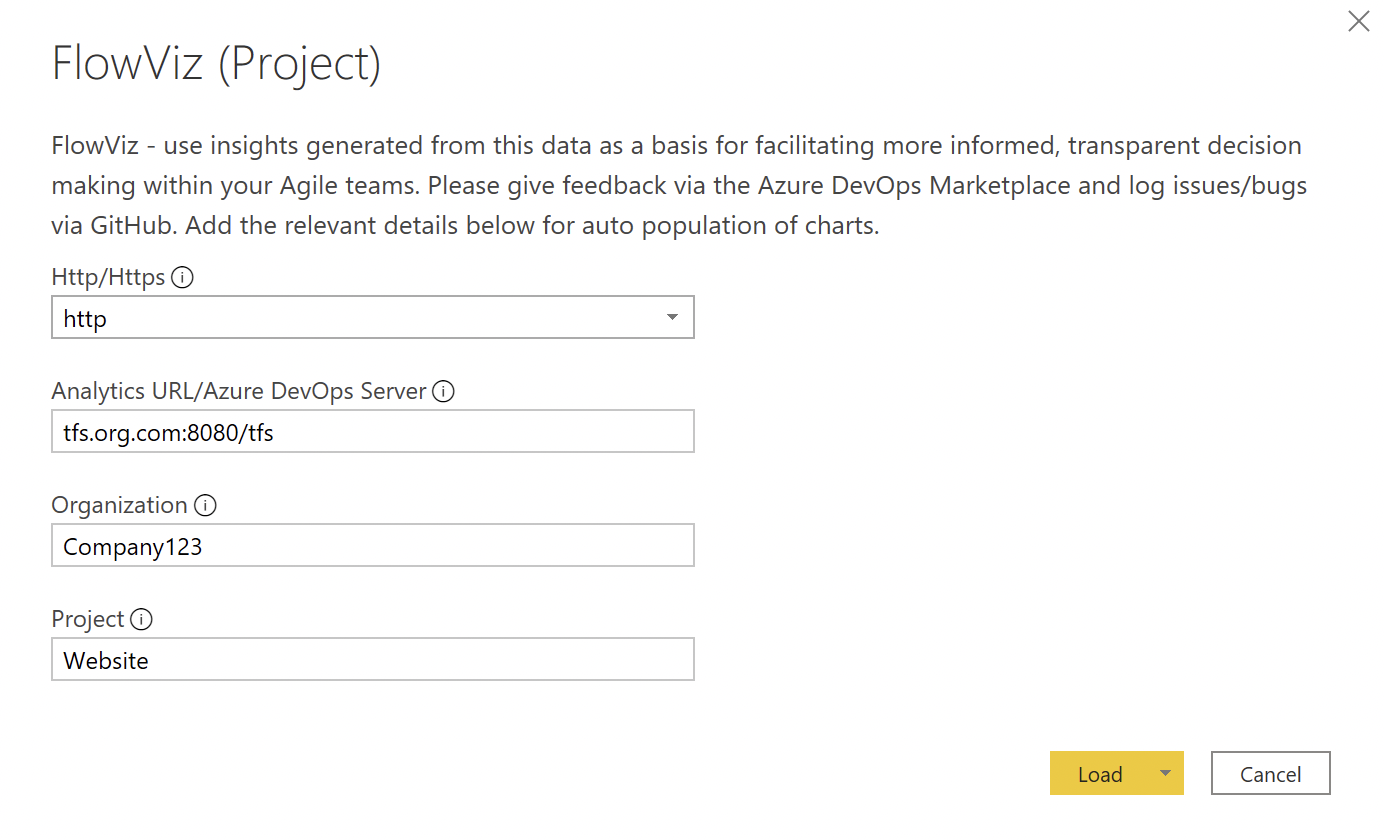
Yes! When you are entering your Analytics URL/Azure DevOps Server value, be sure to add /tfs into this parameter.
For example if your TFS server is http://tfs.org.com:8080/tfs/Company123/Website/
You would need to enter:

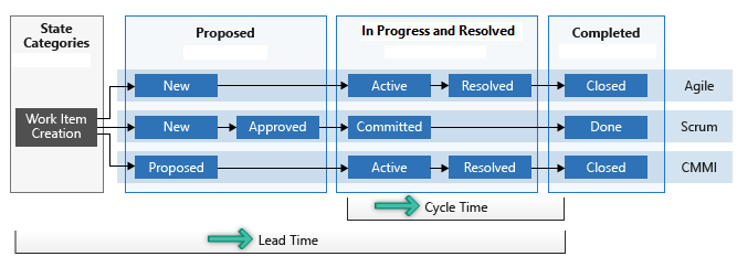
Lead time measures the total time elapsed from the creation of work items to their completion. Cycle time measures the time it takes for your team to complete work items once they begin actively working on them. The following diagram illustrates how lead time differs from cycle time in the context of Azure DevOps.
Lead time is calculated from work item creation to entering a completed state. Cycle time is calculated from a work item first entering an In Progress state to entering a Completed state.
Velocity (sum of effort/story points) is a metric that is easily abused/gamed and, through my years as a practitioner, I’ve found it to be pretty useless as a metric. It forces teams to focus too much on ‘getting our points up’ or just artificially inflating estimates and thus ‘increase velocity’. Countless studies (including my own) have proven that there is little/no correlation in points estimation, and that it is no better than using count of items (otherwise known as Throughput). Plus, Senior Managers and Executives don’t want to hear about story points, they want a language that makes sense, not some obscure voodoo :) This dashboard is all centred on flow and transparency, in a language that is simpler to digest, hence why velocity is excluded. For more on my thoughts, please check out this series of blogs :)
The Blockers page only works if work items are 'tagged' as Blocked OR if you use the 'Blocked' field in an inherited process template. Any other custom ways of identifying blocked work will not work.
The reason for this is that the dataset used for this page contains all the history of changes to items. If you have work items that appear in multiple boards and/or have changed your board design in the period you are reviewing data for, then this is why duplicates occur. The filters/charts intended design is to read in order of which the columns are on the board, which is done using a 'ColumnOrder' field. This means that if a column has changed order in the time period (say you've added a new column) then it will appear twice.
You can actually limit your queries via a few ways:
- To filter by team - there is guidance from Microsoft's own material here on how to add a team filter for OData queries at the bottom of the page using
and (Teams/any(x:x/TeamName eq '{teamname}') - To filter by date - you can see from some of the FlowViz tables you can also filter by date range. For example the 'Dates' table only takes dates past 1st May 2019 -
/_odata/v3.0-preview/Dates?%20$filter=Date%20ge%202019-05-01T00:00:00Z - To filter by n results - the Microsoft example here shows how you can limit to just the top 10 work items using
&$top=10
Yes - please check out this thread for guidance on how to do so.
Yes this data is available in the Iterations table and already has relationships with the relevant WorkItems tables in the dashboard. Simply drag and drop the iteration name into either the slicer and/or chart X-axis, like so:

Technical data (builds, releases, pipelines, etc.) is available in v3.0 of the Odata API. However, in their current format I’ve found it to be limited in the value it can bring. You can bring them in as additional tables if you wish (follow steps 1-6 for how to do this)

An example of some of the reports you can create is available in another of my repositories.
It's understandable why filtering by tags is something people would like, it's just the data for tags doesn't play nice. If items only have a single tag then this is fine but when multiple tags exist for an item it becomes messy. For example an item tagged 'Improvement' and an item tagged 'Priority' & 'Improvement' is going to be two different entries in any sort of slicer:

This quickly means a slicer for a decent amount of data becomes unmanageable. If you did want to do this, first you would need to ensure all tables have the 'TagNames' field. For example, WorkItems In Progress2 does not have it so you would need to edit in Power Query to bring this field in:

Once you've done this, you would need to create a new table, using the following formula:
Tags = UNION ( DISTINCT('WorkItems Bl0cked'[TagNames]), DISTINCT('WorkItems Blocked'[TagNames]), DISTINCT('WorkItems Blocked2'[TagNames]), DISTINCT('WorkItems Completed'[TagNames]), DISTINCT('WorkItems FlowEfficiency'[TagNames]), DISTINCT('WorkItems In Progress'[TagNames]), DISTINCT('WorkItems In Progress2'[TagNames]), DISTINCT('WorkItems WIP Age'[TagNames]) )
Then, you would need to create a relationship between this newly created table and your work items tables.
Finally, add this as a slicer to your report, then you can filter by tag.
Changing the forecasting visuals is relatively simple to do. Reasons for this could be if you don’t have ‘enough’ data yet but have a reasonable amount, or if you need to "throw away" old data. Just change the 'Input data range' number for the number of weeks worth of data you do want to use. Watch the % stability though!
This isn’t actually true, and a common myth:
-
With 5 samples we are confident that the median will fall inside the range of those 5 samples, so that already gives us an idea about our timing and we can make some simple projections (Source: Actionable Agile Metrics For Predictability)
-
With 11 samples we are confident that we know the whole range, as there is a 90% probability that every other sample will fall in that range (see the German Tank Problem). Knowing the range of possible values drastically reduces uncertainty
